ah, art evolution. i know it well, i'm the guy who drew the little guy you see on the homepage. while there is not much to talk about here, there are still things i want to note-so let's begin, shall we?
it is a 80's game. just imagine the most crusty ass art and sprites and that's what it looked like. and ryu didn't always have his black hair and red headband, however: instead, he had candy red hair and a white headband-with the lore reason being that the red headband was actually ken's little headtie once upon a time back when he had a long ponytail, he just gave it to ryu to remember their friendship. or romantic relationship, if you want to see it that way. while i like his black hair incarnation in the immediate second game and later on better, candy red ryu is cute, admittedly. look at him!

shown above: isn't he just neat?
there are some funny looking designs [entirely excusable since this is the first game] in this, such as gen's mean ass stare, adon looking like he stinks, and a very, very peculiar one on retrospective: birdie. see, birdie was revealled to be actually black in alpha, with the explanation for why he was white in SF1 being literally that he was incredibly sick...but incredible sickness does not make your melanin go away like that...so if anything, birdie was probably joking and he has reverse vitiligo.
and here's when the series got a identity. alongside finally having a color palette that kinda continues a bit later into alpha and such [blue purple and black], while it doesn't have the anime stylings bengus brought to the series-it has, very obviously, taken a step into the stylized, with some soft colorings here and there. oh, and it also has went from 80's as fuck to 90's as fuck. on the topic of redesigns...not much changed. ken got his bob, ryu is finally transitioning into having black hair and has some scruff on his chin that gets often forgotten, and of course-his red headband. sagat's got a mortal wound also as a permanent reminder of what ryu did to him, if that's anything. also, vega's hair used to be somewhat brown instead of the blonde he boasts nowadays, and the other vega is just a red color variant of riki-oh's washizaki as stated prior. let's not keep our eye off of him though! the trilogy coming up next has something incredibly funny i want to point out.
and with identity comes style. it is FINALLY anime as fuck now [with a schoolgirl to boot], birdie has went from no melanin to full of melanin, and despite being a police officer-chun-li is walking around in sportswear. the wacky porportions were also kinda carried over from this game since, but one i want to very particularly talk about is M. bison...because i would like to remind you that the alpha games were prequels to SF2. do you know how bison was built like in SF2? he was built like a normal human being who happend to be fairly muscular, that's what. but here, partially thanks to the animated movie, he's built like a compact tank. so, for a point in time in-universe, bison has went from a wall of muscle, to suddenly built fairly realistically, and then back to being a brick shithouse. and there was no canon explanation for this unlike birdie's shifting melanin levels. so, what do you think happend? do you think he just sized down for the day? or maybe he's not as filled with psycho power as before? that implies that the amount of psycho power in him dictates how wide he is, actually. maybe that's the real reason why...
also, something that i want to note that also mysteriously dissappeared like ryu's scruff: akuma used to have sharp teeth. like, real chompers. that was only for like a few games...where'd his daggers go? maybe this is worth putting up a hashtag for.
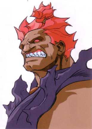
shown above: what you don't see in his shun goku satsu is him biting the oppotent, for it's too grisly.
as for the actual style...it's been drastic. alpha 3 is still the most flashiest thing known to man, that i can say.
also, a quick derail and addendum to this section because i'm unsure where else to put it: but a thing i never see anyone mention is that M. bison's skin color just keeps fluctuating depending on the game. not just him, but also sagat. even in their debut game where they're fairly light in-game [not really with sagat but whatever], the illustration with all of the roster and bosses lined up has the both of them be fairly tan.
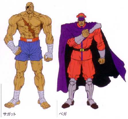
shown above: a last seen photo of where their melanin went.
and then in alpha...they aren't as dark! then in SF4 they're oliveskinned! then in SFV it's hard to tell due to the lighting! then in SF6 bison is back to being darker skinned-infact he's probably the most darkskinned he has ever been! make up your damn minds!! i think street fighter just has a weird relationship with skin color actually!!!
the flashiness continues. oh my god the flashiness continues. it's a evolution of what alpha's been doing, but in terms of redesigns-literally nothing to see here beyond akuma getting his first grey hairs...how old is akuma, anyway? he must be around gouken's age, probably younger since it took him until SF6 to get all grey.
do you think i'm idiotic enough to leave one stone unturned? it's the first 3D street fighter game, after all. unfortunately, while it is a little stylish in some parts, it's a 90's 3D game. you know what these look like.
and on street fighter's foray into the late 2000's, we have...a strange looking game. now, i do not actually dislike ikeno's style entirely, the problem is that these characters just aren't really made for it. asura's wrath for example is actually perfect, and guess who's at the helm of it's artstyle. street fighter has decided to actually pick a theme after a identity and style, and the theme is art-you'll see that from here up to SF6. in this specific case, the word of the day is 'ink'. giant splatters and strokes of black ink that are continued into colorful rivers and grafitti in the later games, the colors are fairly muted yet vibrant-almost pastel, in a way, and everything's absolutely bombastic yet dark. it kinda resembles some of these olden japanese illustrations, no? because that's definitely the driving force. so, what's actually the problem here?
everyone looks stiff. everyone looks like blocks. every male character, i should specify. except dhalsim, somehow. or any of the new guys. incredibly high-held tense shoulders, every [male] character looks like if you knocked on them they'd make a hollow sound, and look at what the fuck they did to ryu dude he looks like he doesn't think
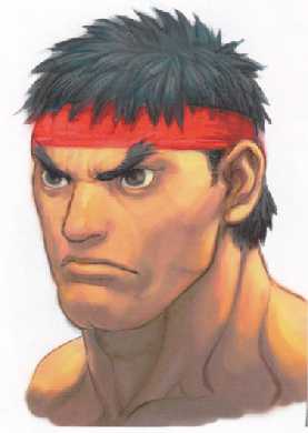
shown above: a rare fish.
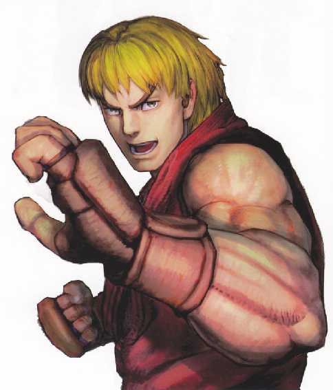
they also weren't kind to his childhood friend, either. talk about banana hair, his hair looks like it's been cast in plaster here!
the one thing that i do like though is how incredibly frowny M. bison is in his official potrait for the game.
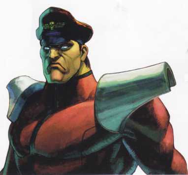
shown above: today's a particularly bad day for him.
you know what survived the plasterification, though? the female characters. they all look normal, even if sakura's hair does still look like plaster. also, LOOK AT THIS GUILE.
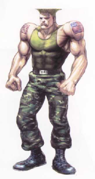
shown above: his shoulders are forever going to be locked like that.
also, i would like to point you all to this particularly nefarious looking gen. why the fuck does he look devious? i don't even know.
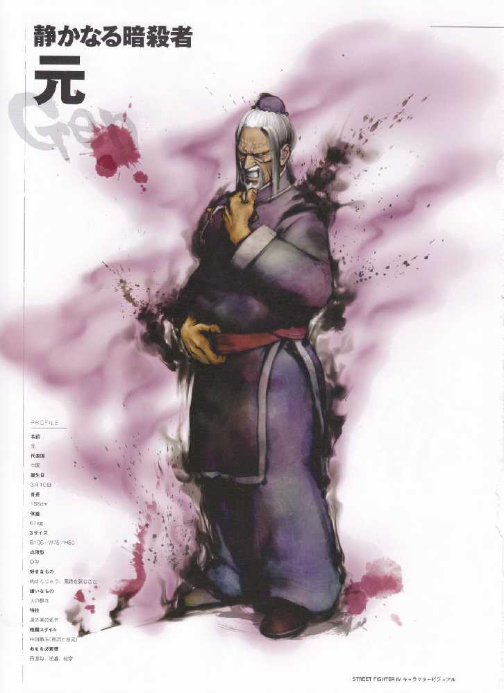
shown above: you can hear the laugh.
i have stated this before on this site i believe, but i might be of a controversial opinion on this. as the game continues the little art legacy of SF4, SFV's word of the day is 'oil'. did it adhere to that? ...eeeeeeehhhhhhhhhhhh not through the whole game. i strongly doubt that the story mode cutscenes are drawn by the same bengus that did street fighter alpha's artwork, but rather these seem more like the result of me mucking around with the watercolor tool and layer modes on preexisting linework done by bengus himself while he was being held at gunpoint and then forgetting the memory entirely and seeing that my complete boredom in coloring form has ended up in a hyped up fighting game with massive campaigns and advertizing that's being peddled for e-sports and wondering how it managed to get in there and coming to the conclusion that capcom stole it and didn't even hire me. the character profiles also don't really fit in that much...but they're neat so who cares. the real controversial part of me talking about this is my actual opinion on the artstyle of the game itself, 3D models and all specifically, in which...with awareness of it's flaws [it's not just ken's hair, some other people's hairs are fucked too-and SF4's ''every male character looks like shit'' thing kinda rubs on some select characters since some of them look like pugs], i geniuenely think this is peak street fighter. this is peak 3D street fighter, at that. it's cartoony, it's anime, it's silly looking in all the right ways and cool looking in all the right ways. they look like action figures yeah but is street fighter not a goofy ass series sometimes? that's literally a part of it. the lighting is perfect too! oh, and the 'muscle explosion' look works. fight me. yoshinori ono was right with his muscle fanaticism. i can die on this hill. the more stylistic promo pictures are fun too-boasting the rivers [yes these are supposed to be emblematic of rivers] flying around and accenting the characters, each colored respectively and analogous to each character [except cammy, who gets a union jack-colored stroke instead. is her being british that important?]
as for the redesigns...there's actually plenty. time flies, ryu looks the exact same, cammy now has a harness, birdie has been reduced to the role rufus was filling last game, vega has a shirt on so he can boast about his cleavage, ken masters's design is great ignoring his dole branded hair grown from the finest trees, charlie nash is now stein from soul eater, they somehow made rainbow mika even skimpier, they made seth a bad bitch, they made M. bison old though him going white at the general same time as dhalsim did implies that he's kind of around his age, blanka is a ball of fluff now, sakura is finally out of school, akuma is now a sunflower, alex's hair is now made of fries, cody's finally free for once and immediately put in as the new mayor of metro city [explanation for why you can fight anyone in metro city in SF6's world tour mode], whom else? juri and her rubber?
my fucking god, i can finally talk about this game on this site. this is fairly unique...but also kinda not unique, since SF3 did the street thing first didn't it? but SF6 takes it to a different level-while i do think the emphasis on 'street' is a little bit heavy, it is absolutely perfect. the grafitti focus, the concrete, the SETTINGS, the DRIVES, this is how you do the street part of street fighter. look, even ed is thriving! i liked his SFV design though but despite going from fairly wide to played by robert pattison, his newer SF6 design works too. that's what getting used to things does, anyways! while the more realistic style that still tries to be a bit stylized is...hit or miss, it doesn't deter from the entire game's visual style. in terms of redesigns, you got 5 million of 'em. ryu finally looks different and yet the exact same, luke has actual hair for once, blanka in overalls :D, ken is homeless, akuma is now wearing the pelt of a dead animal, zangief is finally wearing pants after 30 years, cammy didn't like her braids, M. bison is homeless and with a horse and also looks cool as fuck, what the fuck is juri wearing, and rashid now actually looks like a influencer i can see in my country or anywhere in the gulf or the emirates as long as it's a area that's huge and home to people who love views. this list may keep going the more this game gets characters, who knows.